New license management system at Sonar
SonarSource traditionally offered a single product with features bundled together. As the product suite expanded, there was a need to introduce a flexible licensing model that allowed customers to choose and pay for specific features.
Overview
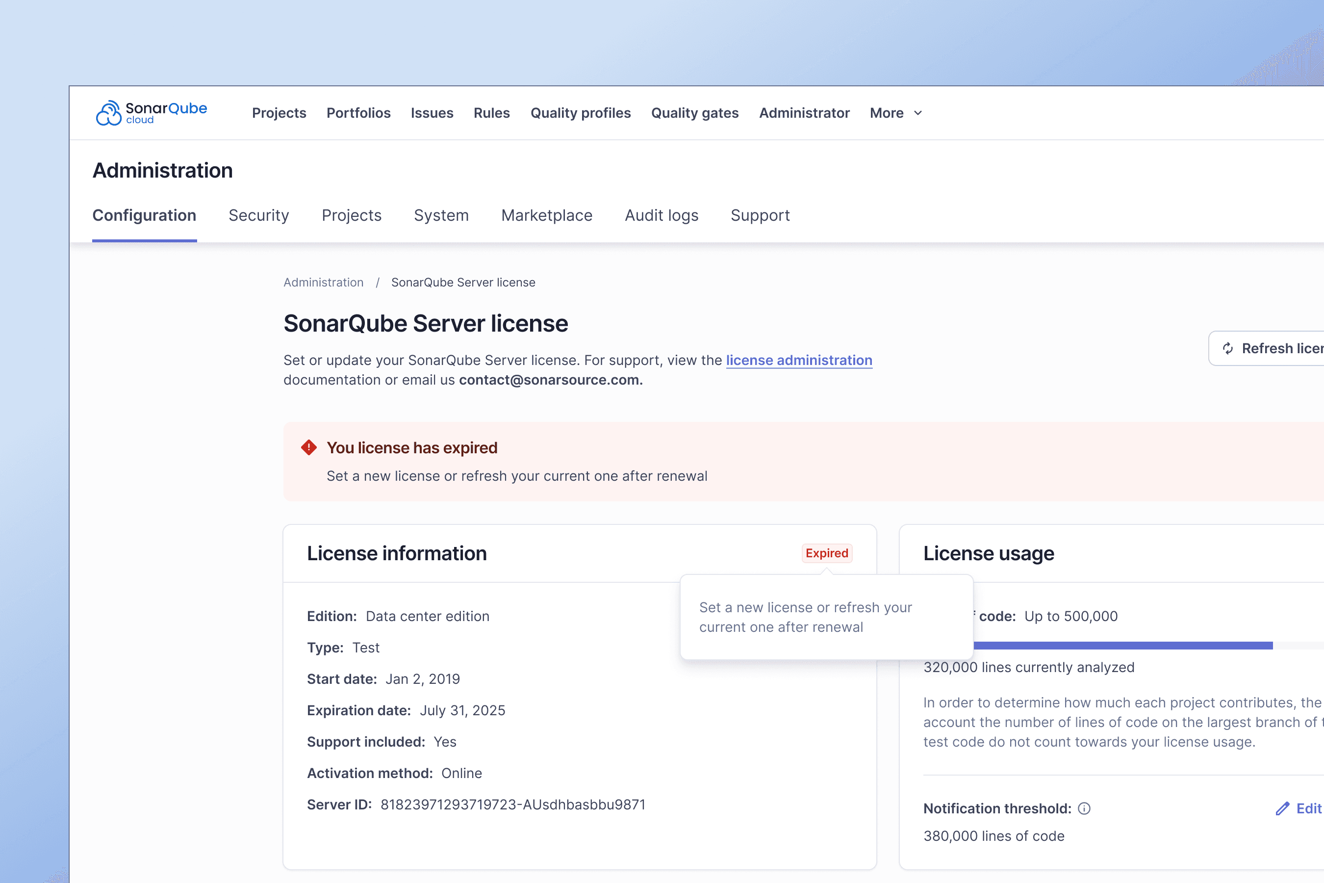
SaaS solution for high quality code
At Sonar, we transform the development cycle with actionable code intelligence that drives better, more secure code. Easily integrates with DevOps platforms to deliver continuous quality improvements without slowing teams down.
Serving companies like
Trusted by over 7M developers


Chapter 1: Defining our north star
Everything starts with a name: Echoes Design System
Why Echoes? Well, it’s not just a cool name; it’s a nod to echolocation – this is how whales navigate and find their way. In SonarSource’s world, Echoes is going to guide us through the sea, navigating more efficiently and spotting gems that make our products intuitive, accessible, and consistent.
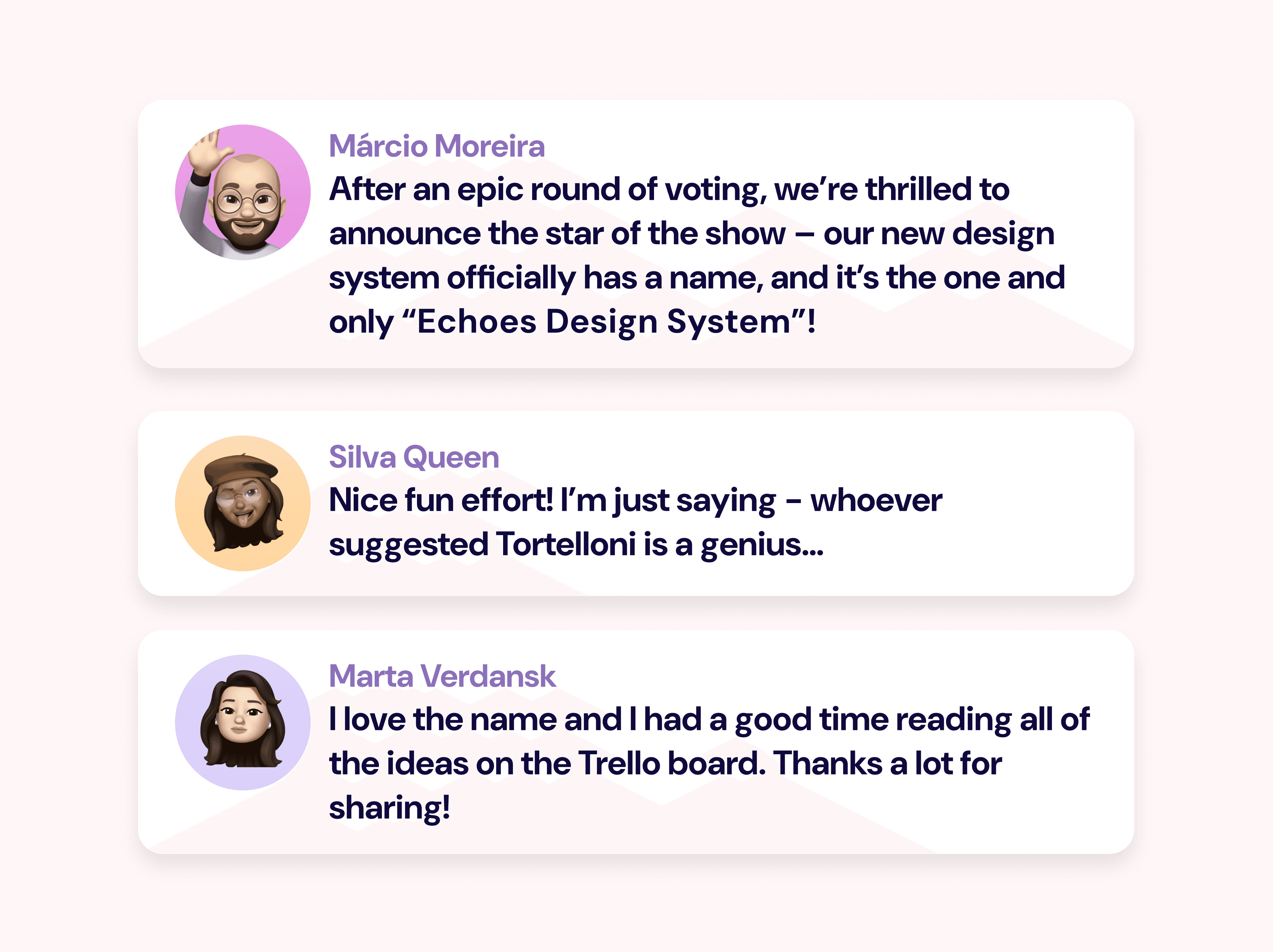
To bring awareness and engagement early on, we decided to ask to our colleagues and future community to propose ideas for the design system name.
Building the Core Team
Assembling Expertise to Drive the Design System
After defining the vision and name for our design system, we focused on building a foundational team to bring this vision to life. Our initial team comprised:
UX Designer: Focused on crafting user-centered components and ensuring the design system met accessibility and usability standards.
Two Front-End Developers: Tasked with translating the UX components into reusable code, prioritizing both scalability and performance to meet diverse product needs.

Announcing our North star
⭐ In two years, Echoes Design System will be the starting point for accessible, consistent and efficient UI at SonarSource
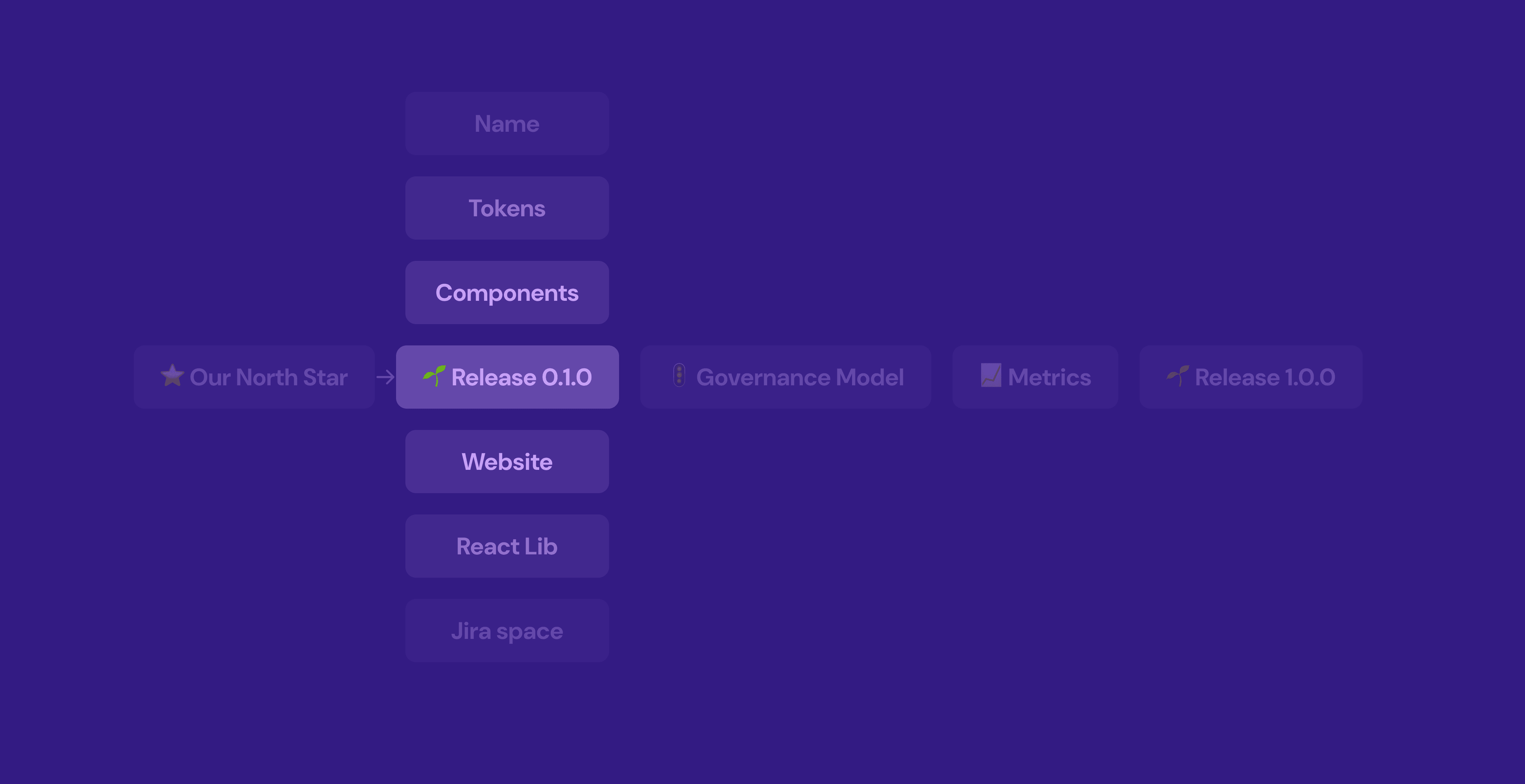
Chapter 2: First release
Milestone Two: Unveiling the First Version of Our Design System
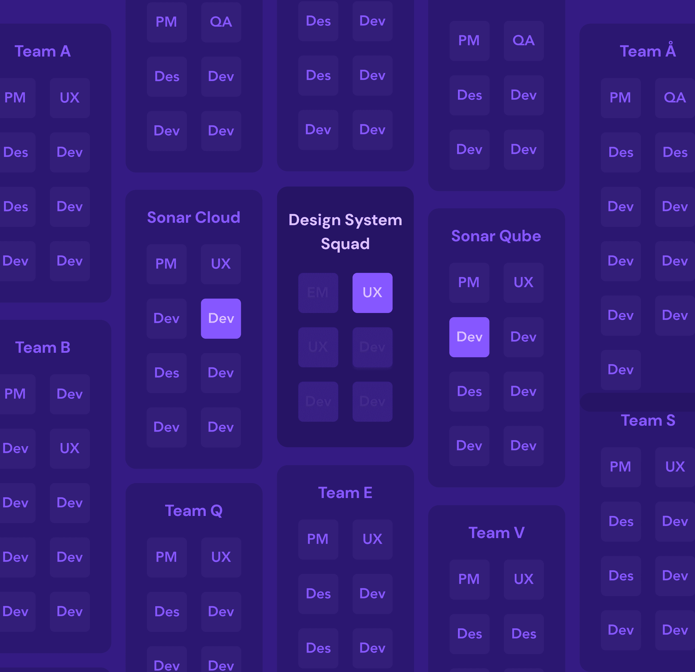
SonarSource operates with a diverse product suite and multiple engineering teams, each dedicated to developing and maintaining tools for code quality and security. This structure amplifies the need for a centralized design system to ensure consistency and efficiency across all products.
Chapter 2: First release
Research and Discovery for our first release
To ensure our design system was grounded in practical needs and scalable solutions, we began with a focused discovery and research phase. This involved:
Conducting a Technical Audit: We assessed existing UI components, code structures, and design patterns across products to identify redundancies and inconsistencies. This gave us a clear picture of where standardization could bring the most value.
Engaging Stakeholders Across Teams: Collaborating with product, UX, and engineering teams helped us gather insights into specific technical challenges and design needs, allowing us to align on common goals and prioritize effectively.
Identifying Key Technical Requirements: From performance considerations to accessibility standards, we established core technical requirements that would guide component design and development, ensuring that our system met both current and future needs.
Chapter 2: First release
Establishing Our Core Foundations
For our initial release, we prioritized foundational improvements to elevate the user experience and support a consistent brand identity. This release focused on:
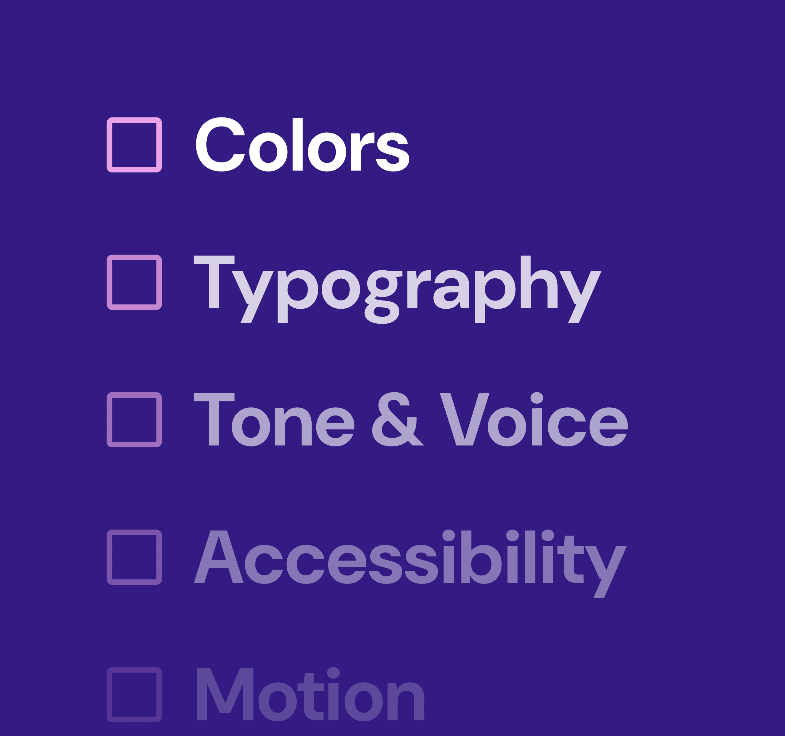
Core Design Elements: We standardized foundational design elements such as color palettes, typography, and spacing guidelines. This created a cohesive visual language that reinforces brand identity and enhances usability
Comprehensive Documentation: Detailed documentation was developed to support these design elements, giving teams clear guidelines on how to use colors, fonts, and other core styles. This helped ensure consistency across teams and products.
New Component Rollout:: To address immediate UI needs, we launched five essential components, including buttons, form fields, modals, and more. Each component was designed with accessibility and flexibility in mind, meeting both current and anticipated requirements.
Chapter 2: First release
Creating a New Workflow Using Token Studio
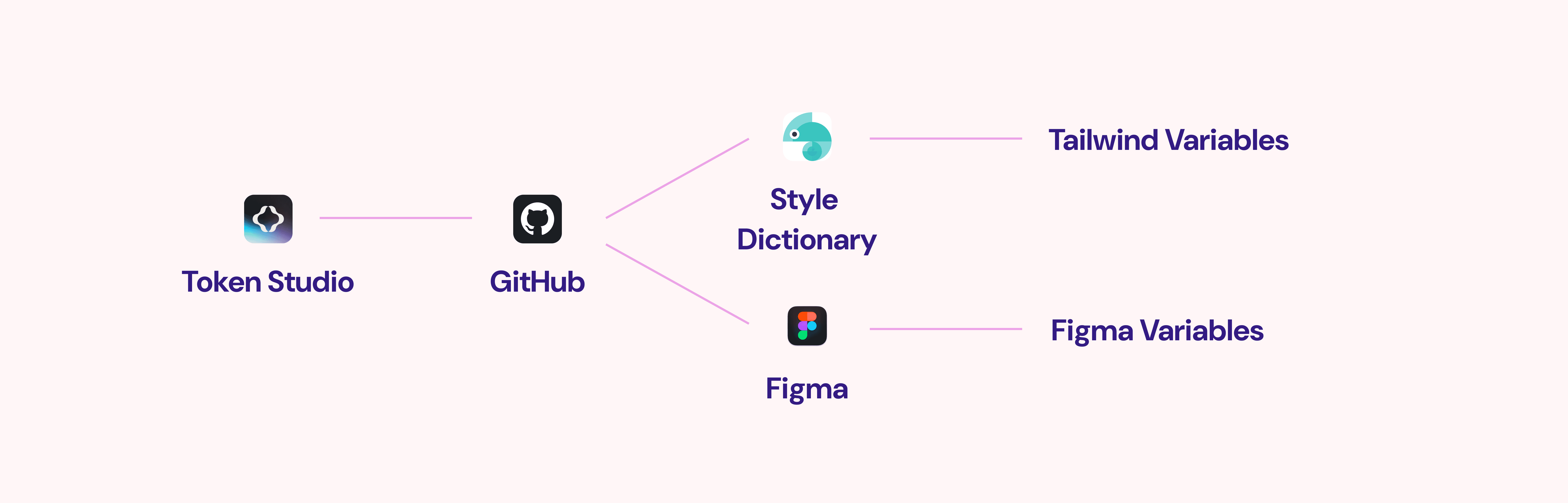
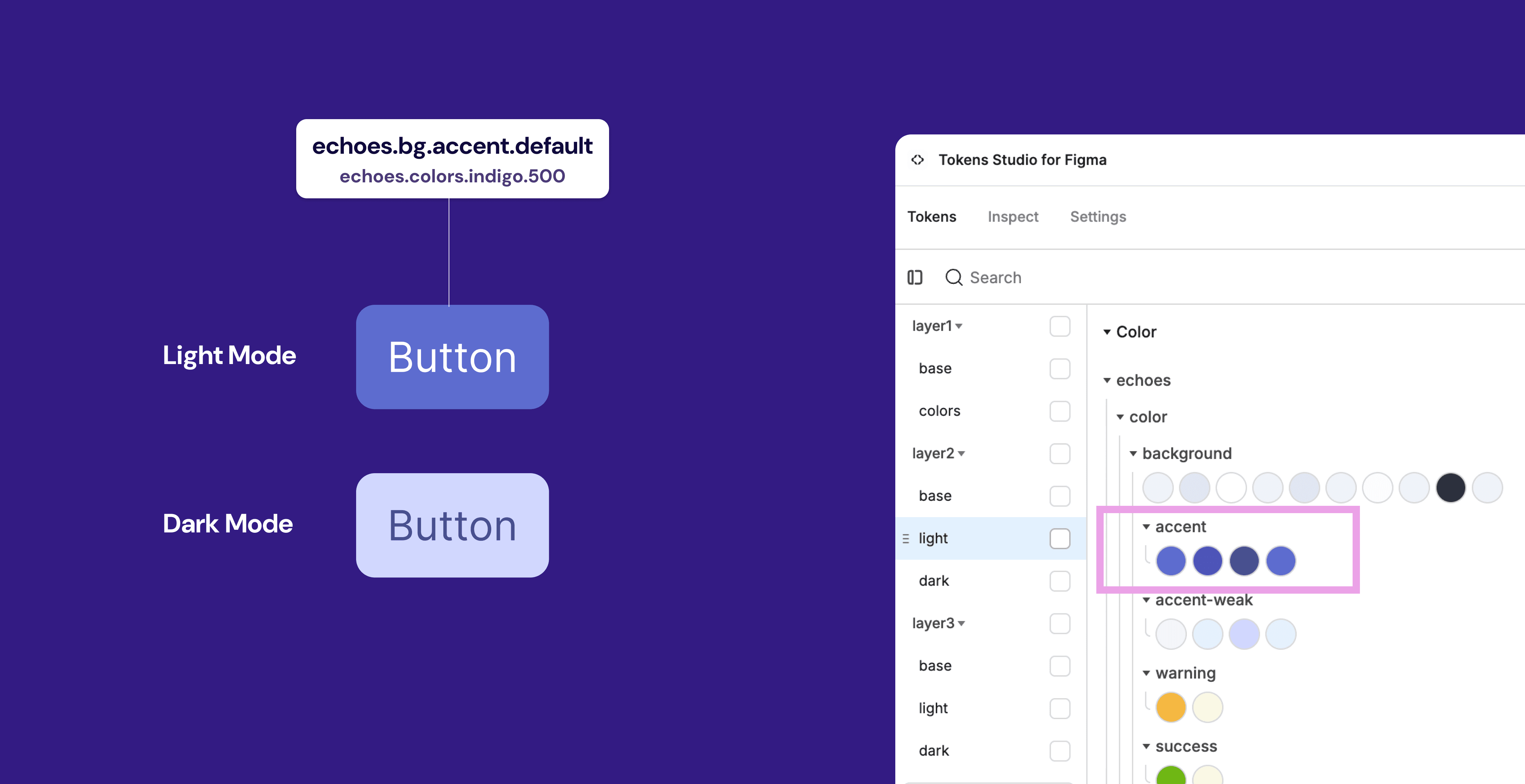
Token Studio is a Figma plugin that enables designers to create and manage design tokens directly within Figma. Design tokens are small, reusable style definitions (like color, typography, and spacing) that ensure consistency across various products and platforms. UX define tokens in Token Studio, setting up properties for colors, fonts, spacing, shadows, etc., which are then stored in a central location. Token Studio also supports different themes or variations, allowing designers to easily switch between, for example, light and dark mode tokens without affecting the rest of the design.
Chapter 2: First release
Core foundations as design tokens
For our first release, we took a new approach to managing core design elements by introducing design tokens. Previously, we relied on a combination of Figma styles and CSS variables, which often led to inconsistencies between design and development outputs. By shifting to tokens, we established a single source of truth for design properties like colors, typography, and spacing.
Chapter 2: First release
New Figma and Code Libs
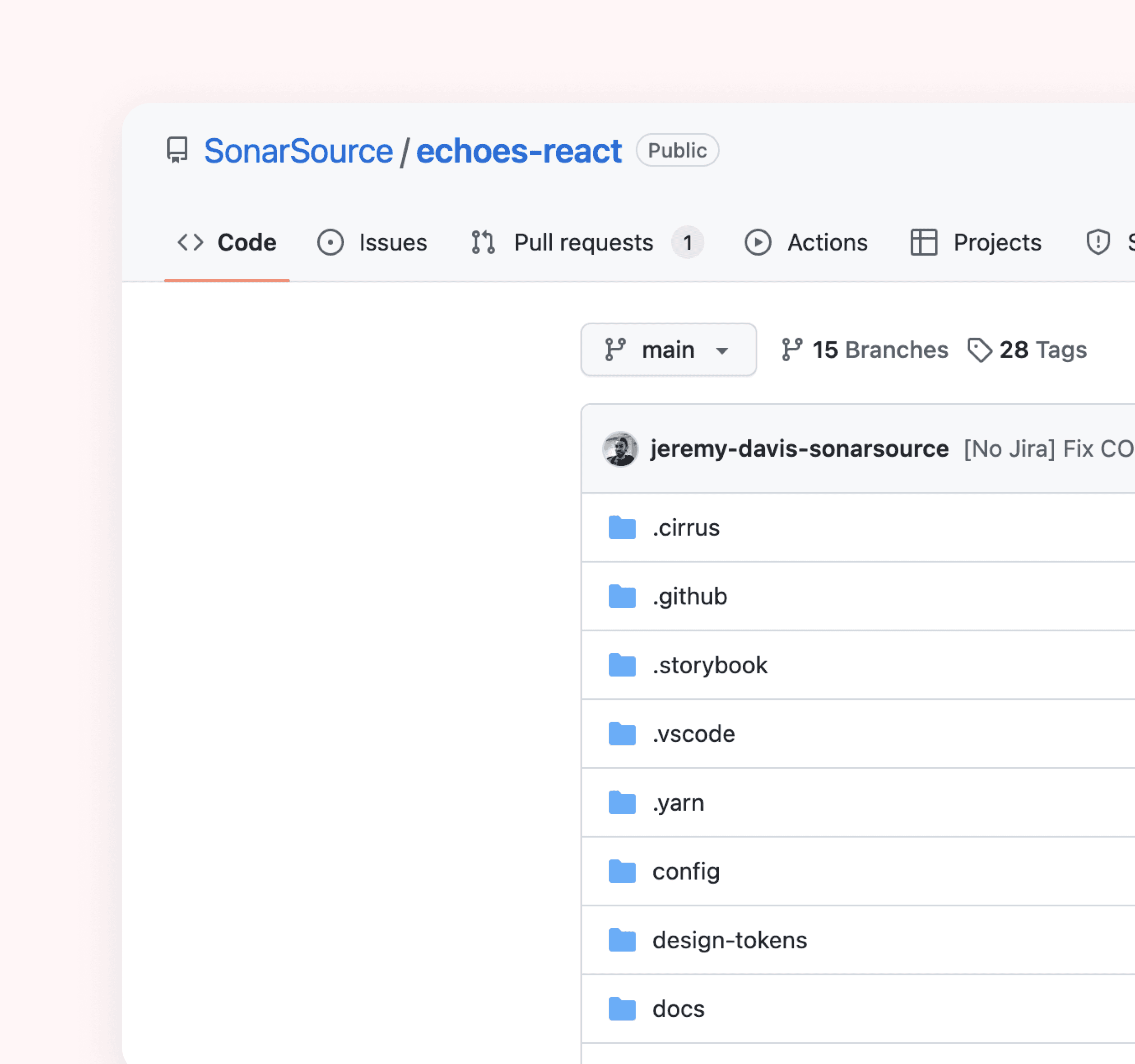
As part of our commitment to creating a cohesive and efficient design system, we undertook the significant task of developing new Figma and code libraries while systematically deprecating outdated ones. This process involved several key steps:
Chapter 2: First release
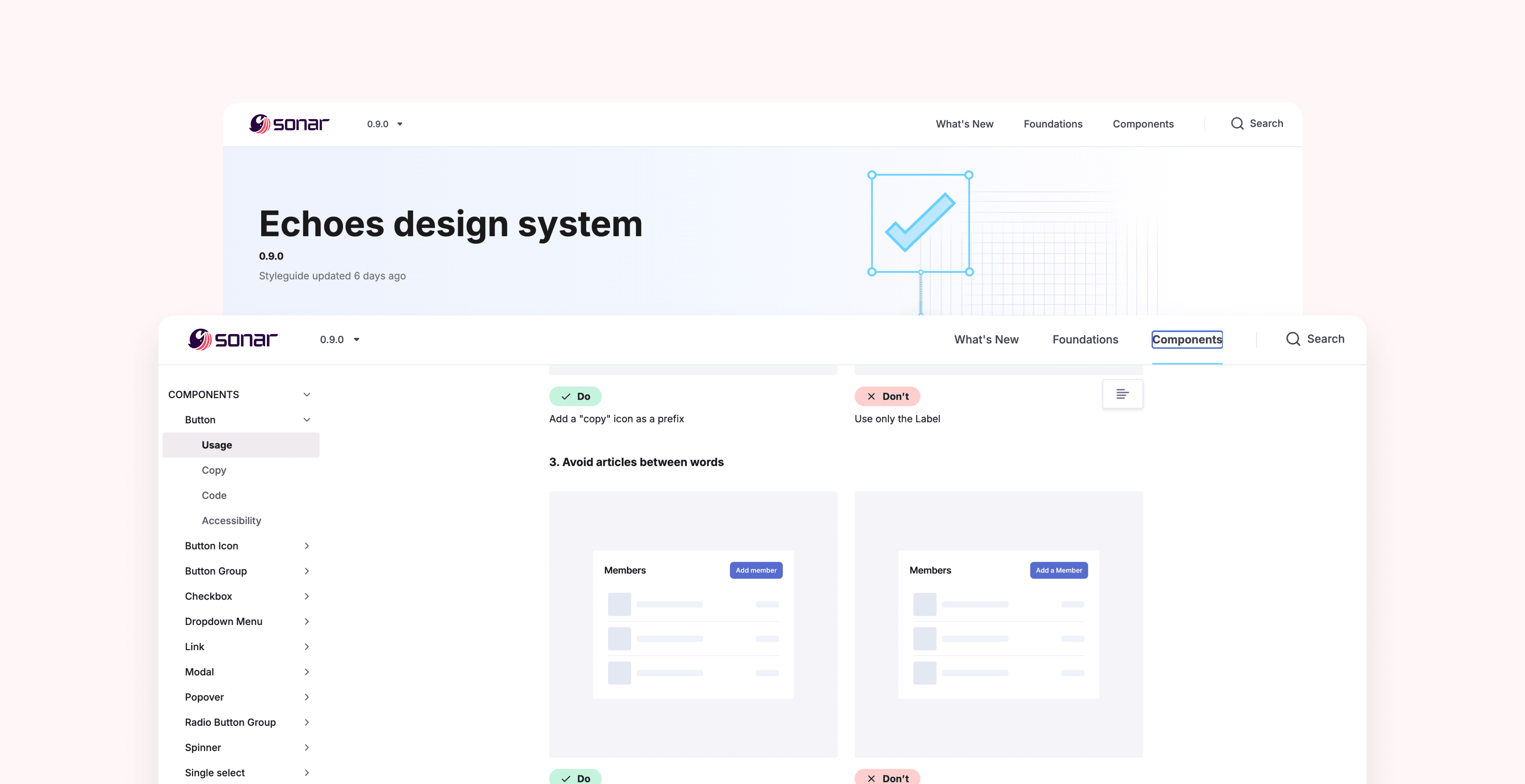
Introducing echoes.sonarsource.com
For our first release, we took a new approach to managing core design elements by introducing design tokens. Previously, we relied on a combination of Figma styles and CSS variables, which often led to inconsistencies between design and development outputs. By shifting to tokens, we established a single source of truth for design properties like colors, typography, and spacing.
Chapter 2: First release
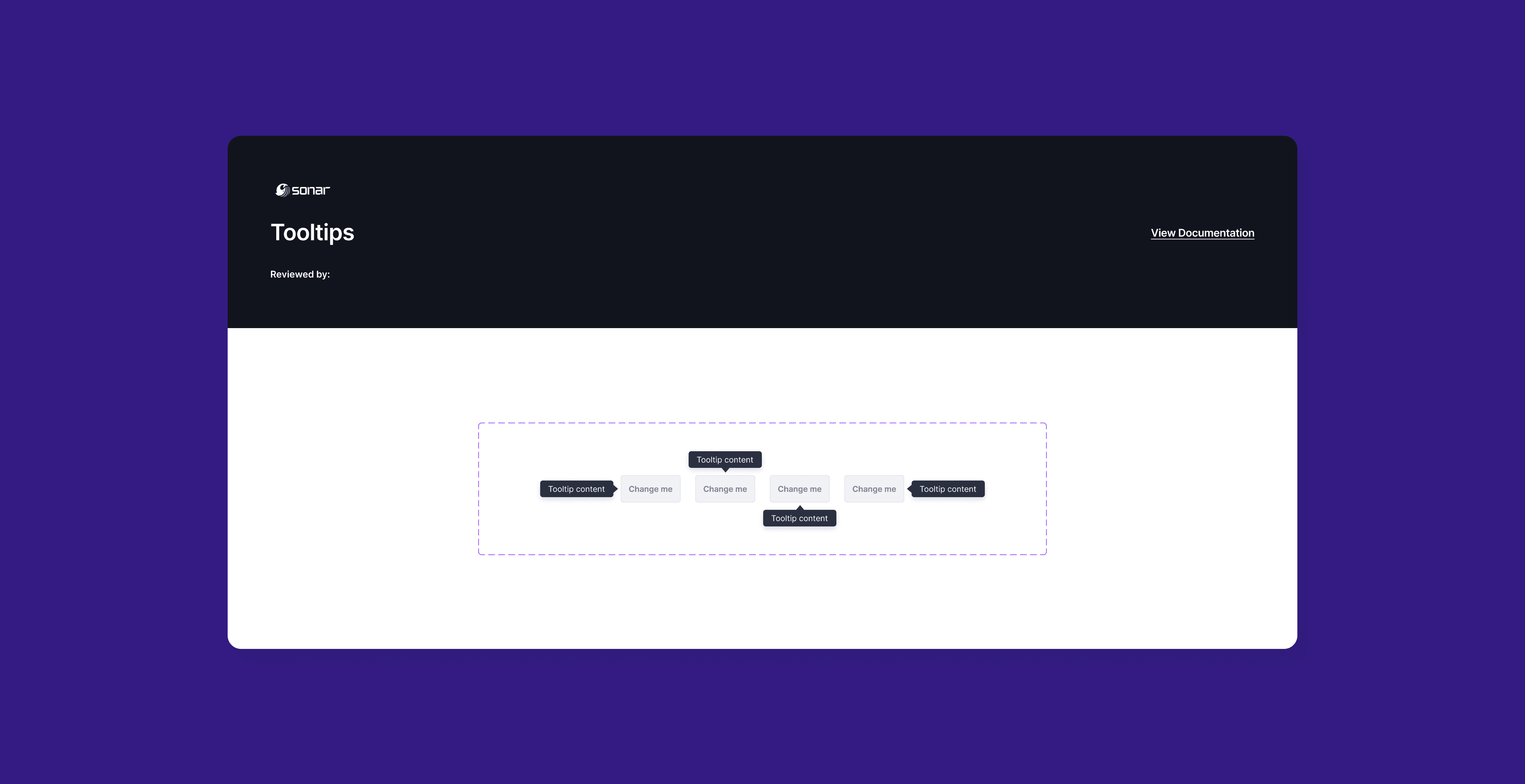
New components in Figma
For our first release, we took a new approach to managing core design elements by introducing design tokens. Previously, we relied on a combination of Figma styles and CSS variables, which often led to inconsistencies between design and development outputs. By shifting to tokens, we established a single source of truth for design properties like colors, typography, and spacing.
Chapter 2: First release
Foundations are set, now we can use them to build UI
With our design system firmly established, we are now poised to leverage its foundations to create intuitive, consistent, and engaging user interfaces across all our products. The groundwork we’ve laid through design tokens, standardized components, and comprehensive documentation enables our teams to streamline the design and development process.
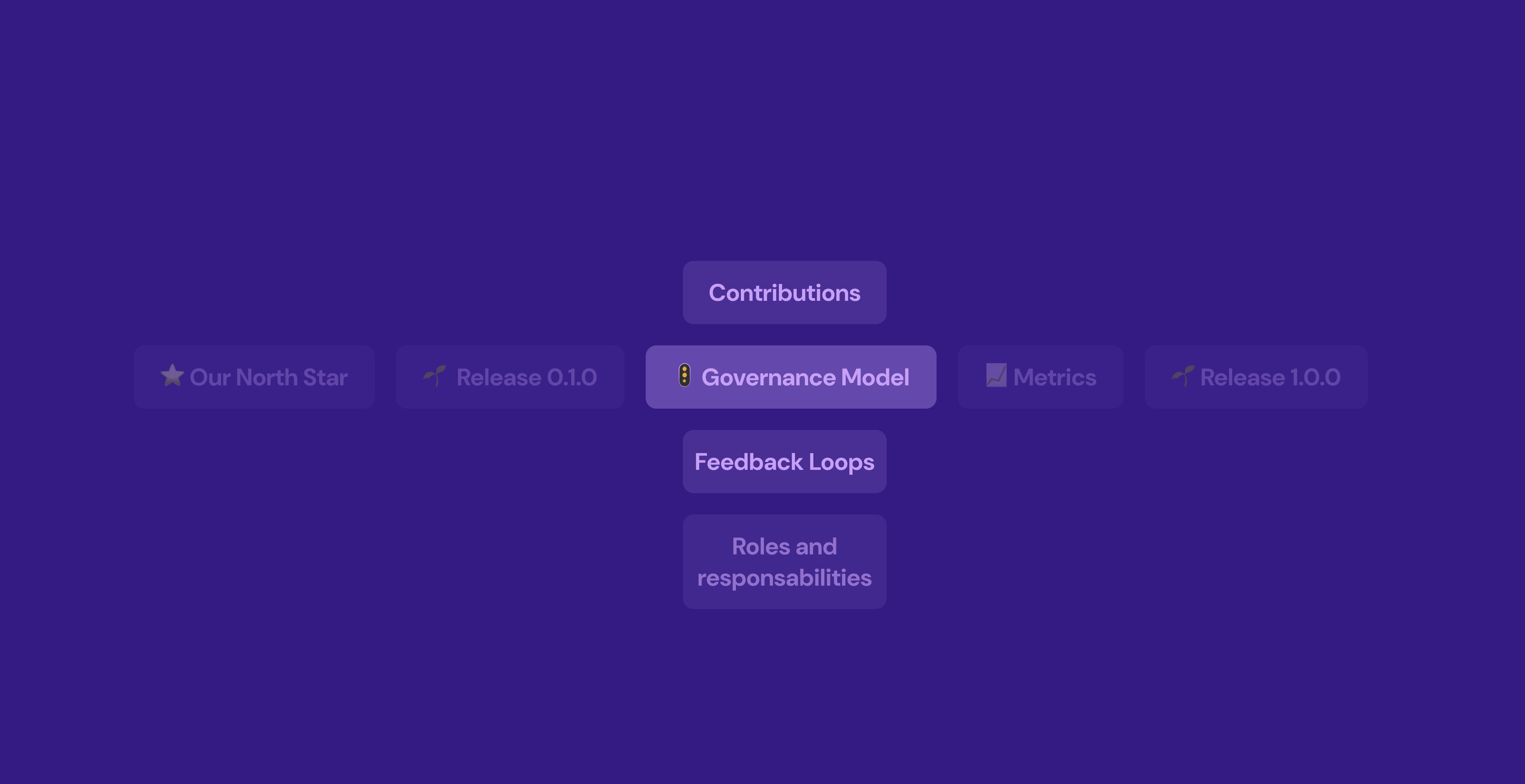
Chapter 3: Governance Model
Building the Governance Model: Processes for Contribution and Driving Adoption
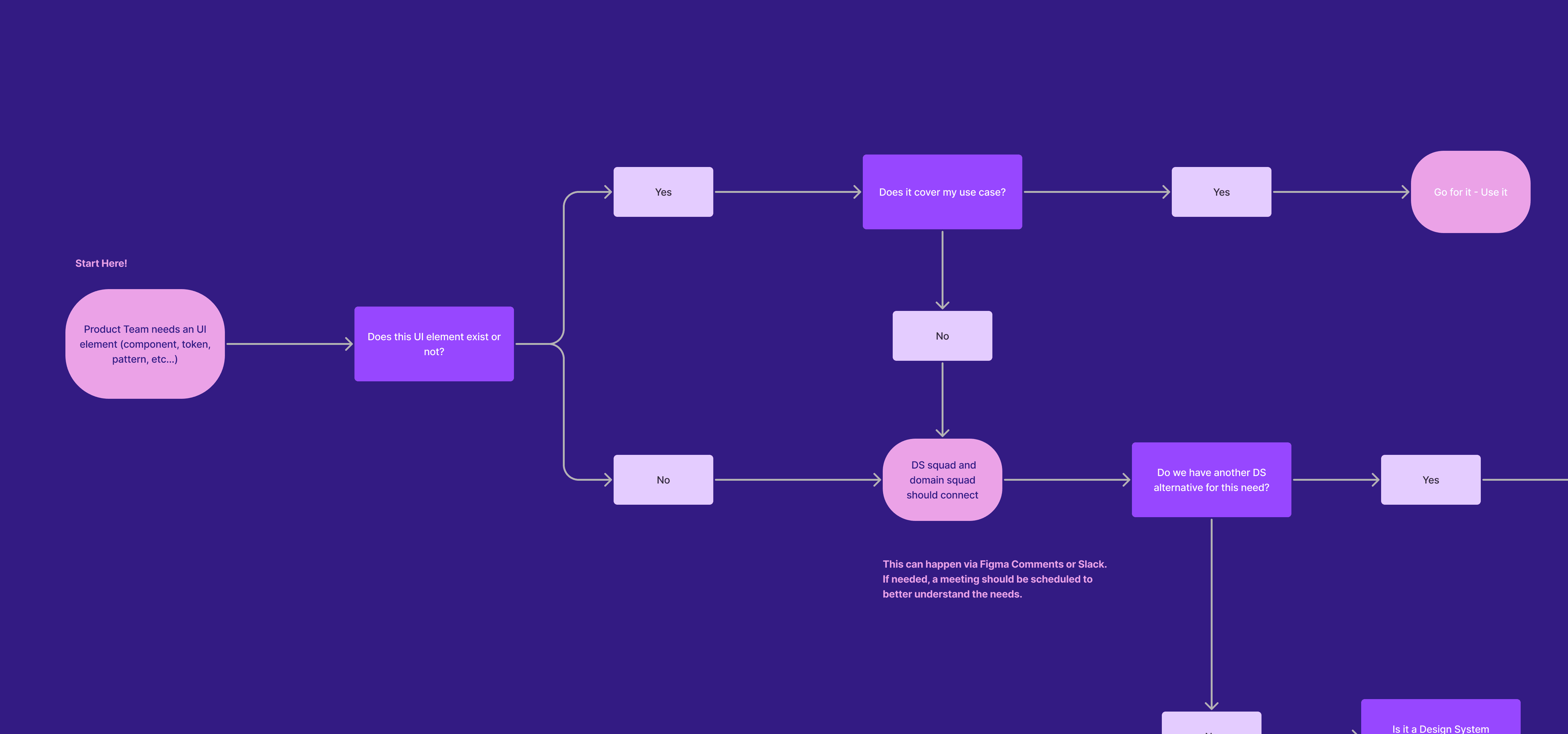
Establishing a robust governance model was essential for the success and sustainability of our design system. This model aimed to define clear processes for contributions while fostering an environment of collaboration and adoption across teams. Key components of this governance model included:
Contribution Process: We developed a streamlined contribution process to encourage team members to suggest changes, report issues, and propose new components. This process included:
Submission Guidelines: Clear documentation outlining how to submit contributions, including required information and formatting.
Review Mechanism: Establishing a review board composed of cross-functional team members to assess contributions for quality and alignment with the design system principles.
Chapter 3: Governance Model
Communication and Training
To drive adoption, we implemented a communication strategy that included:
Regular Updates: Sharing progress and new features through Slack, team meetings, and other internal channels.
Training Sessions: Conducting regular sessions to familiarize teams with the design system, its benefits, and how to effectively use the new libraries and components.
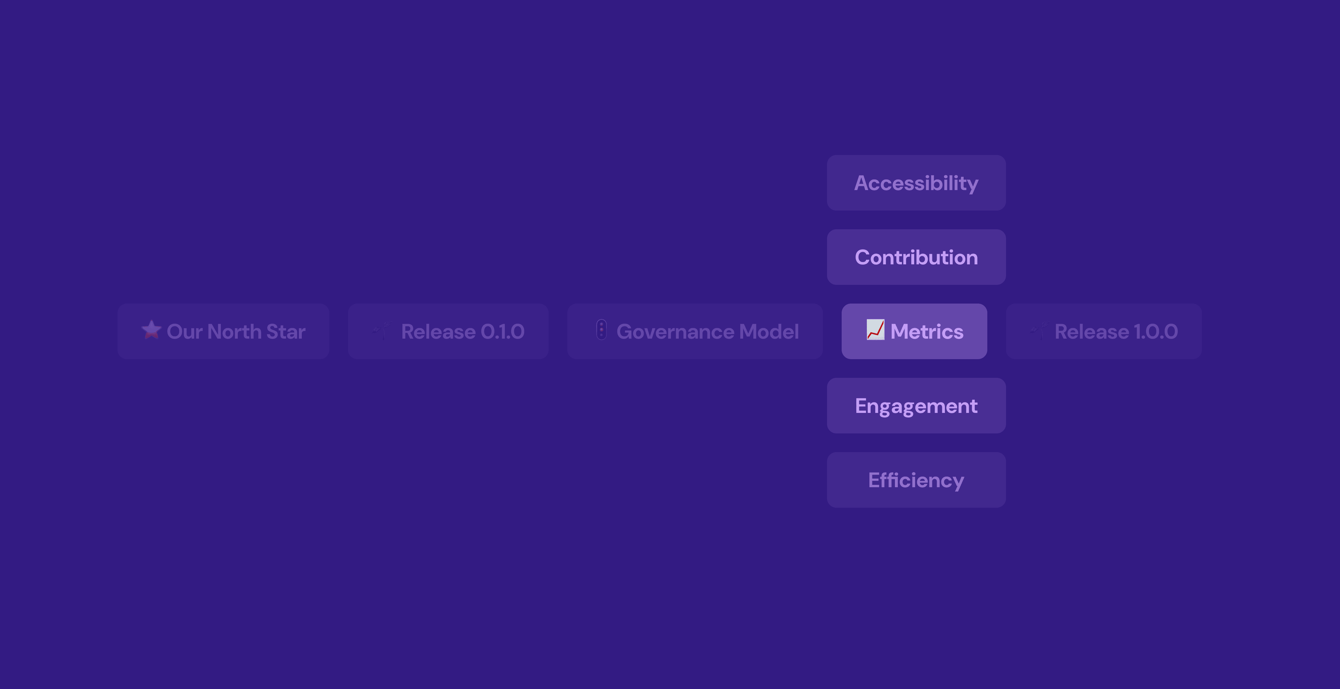
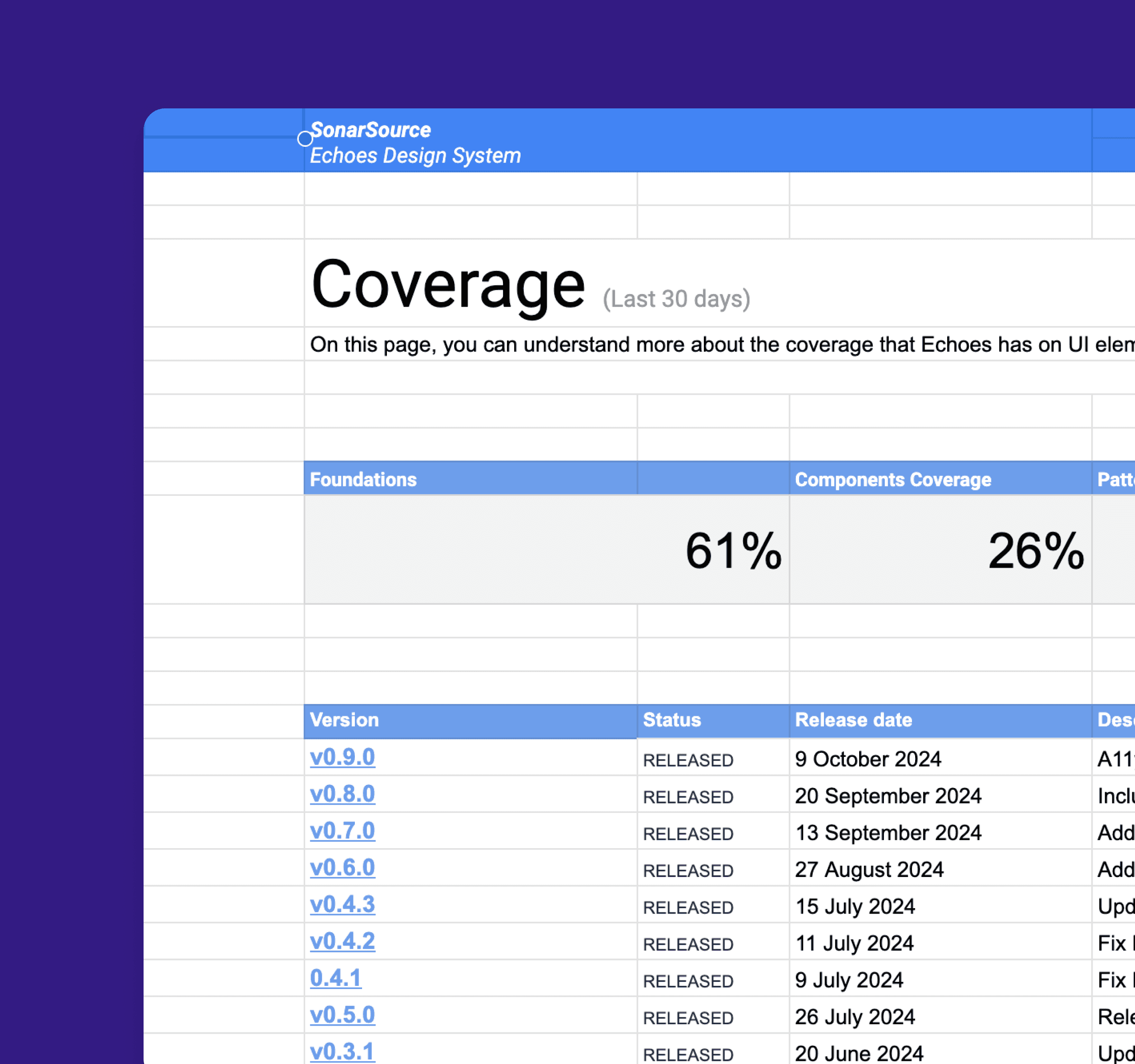
Chapter 4: Design System Metrics
Design System Metrics: Measuring Success and Impact
Establishing effective metrics for a design system is crucial for assessing its success, guiding future improvements, and demonstrating its value to the organization. Here are some key metrics we considered:
Component Usage: Track how frequently design components are used across products. High usage rates indicate that teams find the components valuable. Tools like analytics dashboards can provide insights into which components are most popular or underutilized.
New Contributions: Measure the number of new components, patterns, or design tokens contributed by team members. This reflects engagement with the design system and its perceived value within the organization.
Documentation Access: Monitor the usage of documentation resources, such as the design system’s website or internal wiki. High traffic to documentation pages can indicate that teams are actively seeking guidance.
Cost Savings: Analyze cost savings resulting from reduced development time and increased efficiency. This can be quantified by comparing the costs associated with building features before and after the design system implementation.

MÁRCIO MOREIRA
©
Márcio Moreira
2024