Designing the future of Sonar's platform
Sonar is a code quality and security platform trusted by development teams worldwide. Its core products — SonarQube Server (self-managed) and SonarQube Cloud — sit inside the CI/CD pipeline and catch bugs, vulnerabilities, and maintainability issues before they reach production.
As AI coding agents became mainstream, Sonar's role expanded. With roughly 42% of all committed code now AI-generated or assisted, the challenge shifted from helping developers write better code to verifying code at a scale and speed no human reviewer can match. Sonar's provides a Guide → Verify → Solve approach that wraps around AI agents — setting them up with the right context before they write, catching issues in real time as they generate, and automatically remediating what they get wrong. Customers include ServiceNow, Booking.com, Deutsche Bank, Nasa, AstraZeneca, etc..
Project type
IA and navigation revamp
Location
Geneva, Switzerland
Role
Staff product designer + cross team coordenation
Company
Sonar
Industry
Dev tools
Timeline
6 months
The Challenge
From a single product to a platform
Sonar was making a significant strategic shift: from a single-product company to a multi-product platform. Alongside SonarQube and SonarCloud, the company was now releasing distinct sub-products — Advanced Security, Code Review, and more — each targeting different user needs and buyer personas.
At the same time, AI was accelerating feature development, and a series of acquisitions was bringing additional capabilities into the fold. The product surface area was expanding fast.
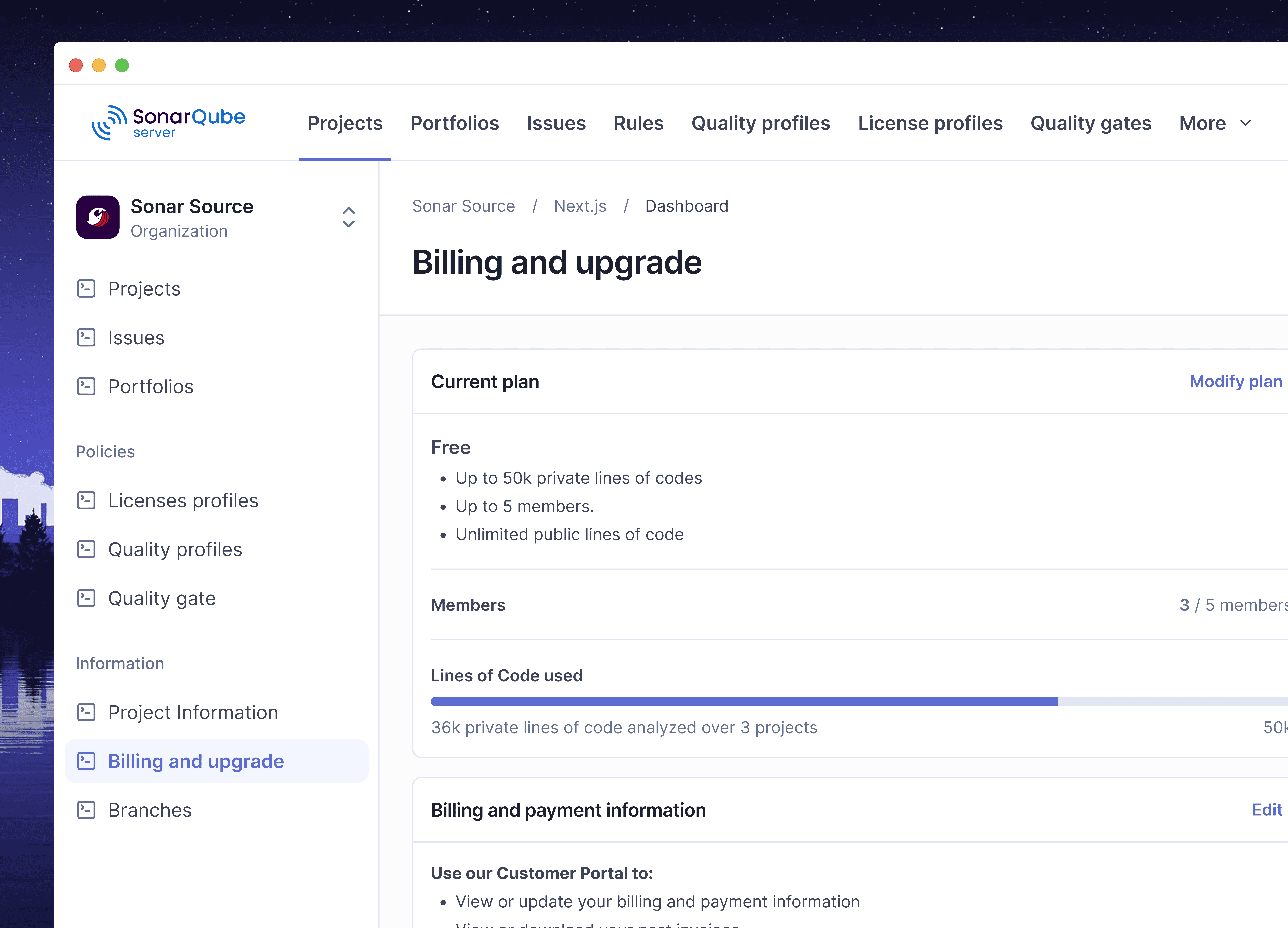
The UI hadn't been designed for any of this. SonarQube and SonarCloud had already diverged in layout, navigation, and IA over time. Adding a growing suite of sub-products into that fragmented foundation wasn't just messy — it was unsustainable. The settings experience made this especially visible: configuration options had piled up organically, with new sections bolted on as features shipped, and no coherent structure to hold them together.
7M+
Developers
400,000+
Organizations
750 billion
Lines of code analyzed daily
The Problem
The UI was built per product
The strategic shift to multi-product exposed a structural design problem. No shared foundation. SonarQube and SonarCloud had diverged enough that designing new features meant solving layout and navigation problems twice. Every new sub-product would only add to that overhead. The information architecture had been shaped by a single product's growth, not by a platform. As sub-products multiplied, there was no clear model for where things lived or how users would navigate between them. Integrating acquired products into the platform meant inheriting even more UI patterns — without a shared baseline to absorb them into.
Goal
Establish a single layout and navigation system shared across Qube and Cloud — scalable enough to absorb new features and future acquisitions without bespoke workarounds.
My role
I led the design end-to-end on both projects — from audit and research through to final delivery. Beyond the craft, a significant part of my work was cross-team alignment
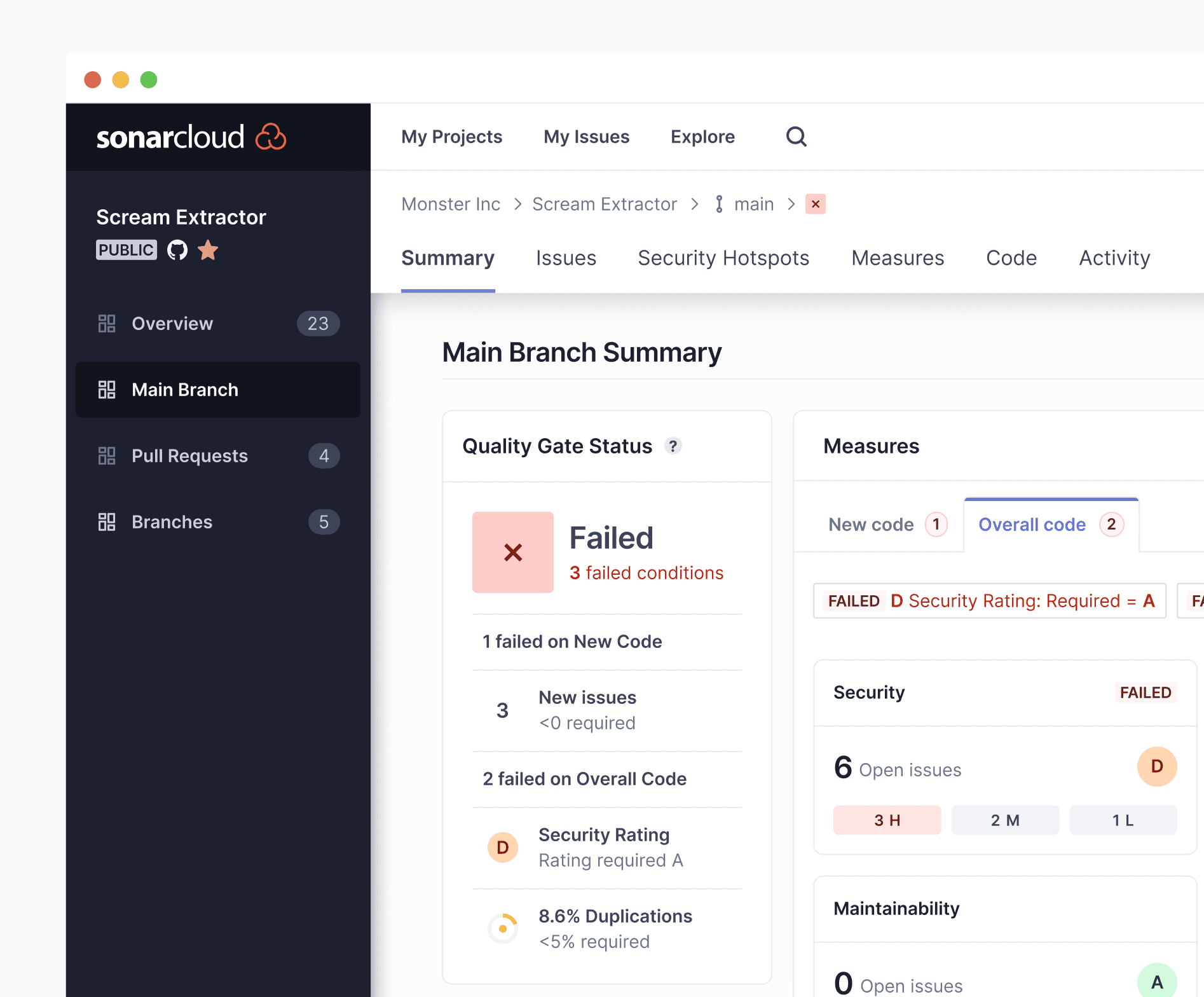
Cloud - Sidebar navigation
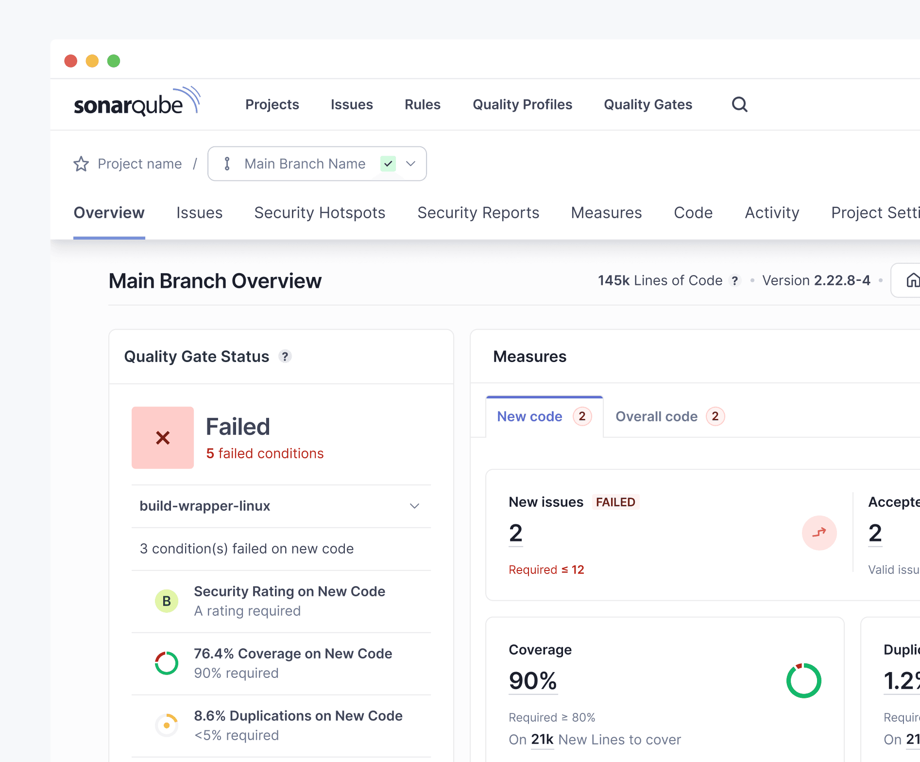
Qube - Horizontal nav
Path 1
In-Store experience
Store entry and in-store experience
The core physical flow, upgraded. A QR code screen designed for the context of standing at a store entrance, a live basket view for transparency while shopping, and a clear exit and payment confirmation.

QR code to enter the store
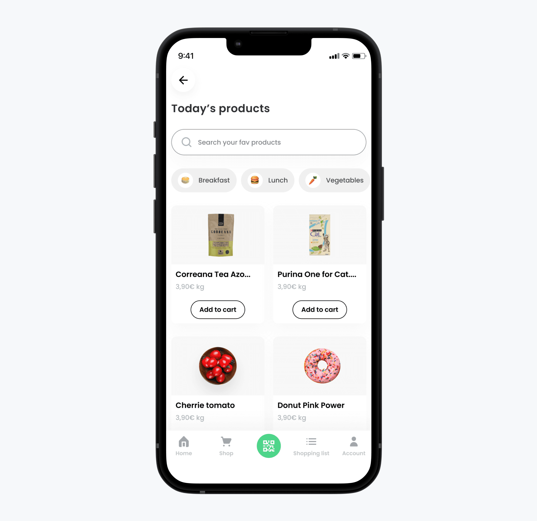
Search items inside of the store
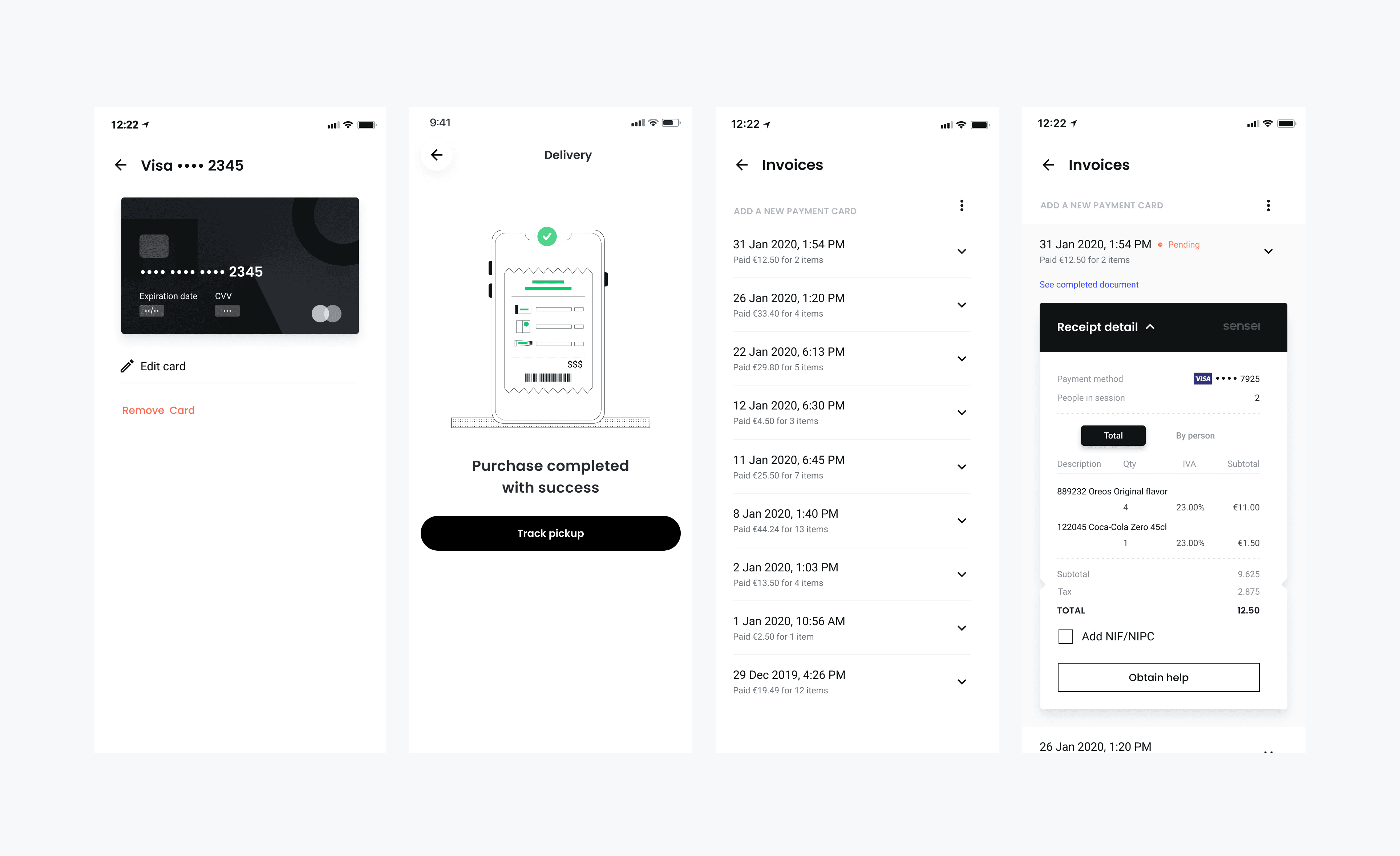
Wallet, receipts and purchase history
A unified transaction history covering both in-store visits and online orders — itemised, timestamped, and consistent regardless of how the purchase was made.
Path 2
Delivery
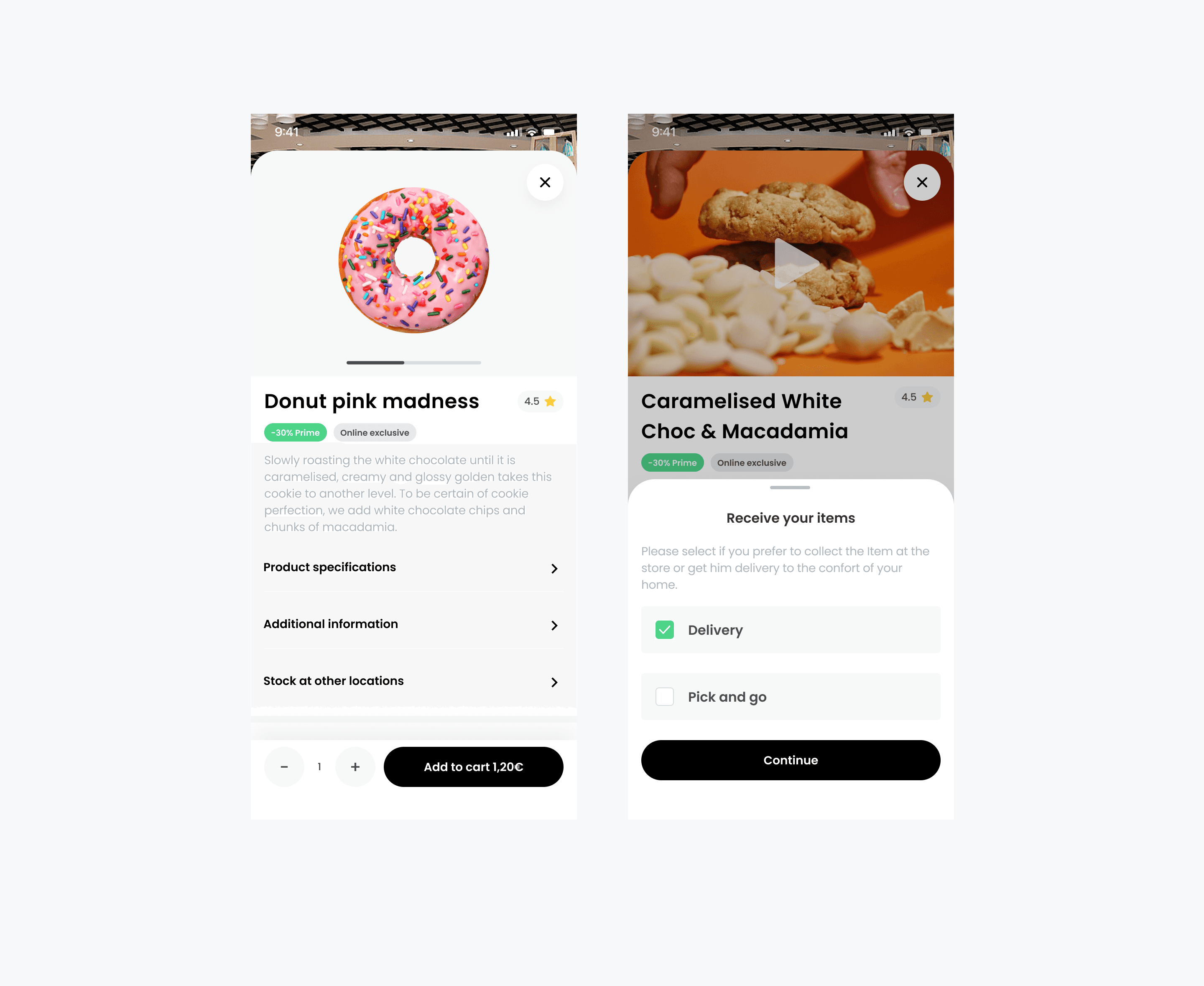
Product overview and pick-and-go
The in-store experience, rebuilt for confidence at the door. Scan in, shop freely, walk out — with a live basket running in the background so nothing feels invisible. Designed for the moment of standing at a store entrance: fast to open, clear at a glance, and reassuring enough that shoppers never second-guess themselves on the way out.
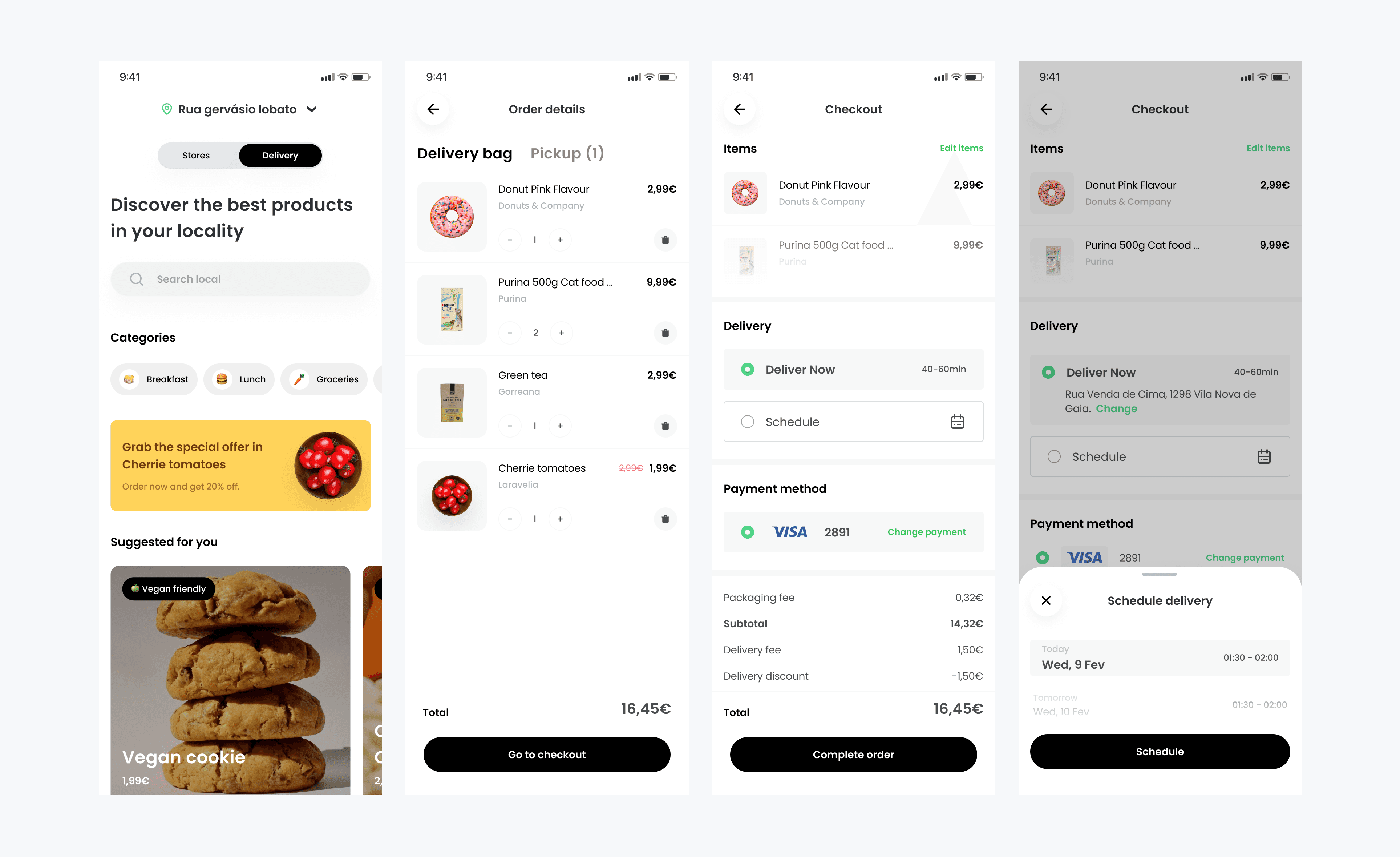
Online ordering — browse, basket, and fulfilment.
A new commerce layer that let consumers browse available products across Sensei's full network of registered stores, pods, and cabinets. A shopping experience designed for remote use, with a clear basket and a fulfilment step that let shoppers choose between scheduled pickup and home delivery.
The resut
Outcome
The project achieved its primary goal — Sensei secured the funding needed to expand their business model. Although the designs were never taken into production, the work played a direct role in making the case to investors. Shortly after, I received a proposal from Sensei to join them as their Lead Designer.
$16M
Funding
